Hover Effects That Don’t Feel Clunky
The timing, easing, and restraint that separates smooth interactions from jarring ones. We’ll break down exactly why certain animations feel responsive and others feel delayed.

Why Timing Matters More Than You Think
Here’s the thing about hover effects — they’re everywhere. Buttons, links, cards, navigation items. But most of them feel off in ways that are hard to pinpoint. It’s not that they’re ugly. It’s that they don’t feel right. The animation takes too long. Or it happens so fast you barely register it. Or it starts immediately when you’d expect a tiny delay.
The difference between “smooth” and “clunky” comes down to three factors working together: timing (how long the animation takes), easing (how the animation accelerates or decelerates), and restraint (knowing when NOT to animate). Get these right, and your interactions feel responsive and delightful. Get them wrong, and users notice something’s off, even if they can’t explain why.

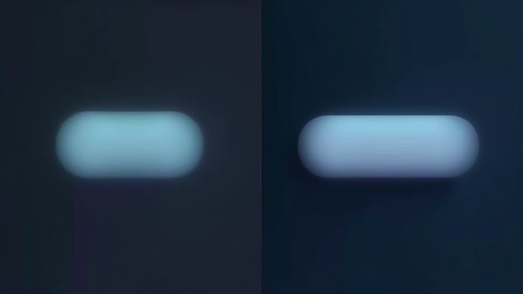
Duration: The Sweet Spot Is 150-300ms
Let’s start with the simplest part: how long should a hover effect take? Too fast and it feels snappy but jittery. Too slow and it feels sluggish. There’s a psychological window where interactions feel natural.
Most smooth interactions happen between 150 and 300 milliseconds. That’s the range where your brain perceives motion as intentional and responsive, not accidental or delayed. A button color shift at 150ms feels instant. The same shift at 500ms feels like the button’s thinking about it. At 50ms? It’s already happened by the time your eye processes it.

Easing: The Difference Between Linear and Alive
Now here’s where timing gets interesting. The same 200ms duration feels completely different depending on the easing function you choose.
Linear easing (constant speed from start to finish) feels robotic. Your brain expects acceleration and deceleration in the real world. That’s why ease-out feels so good for hover effects — it starts fast and slows down as it finishes. It feels like the element is settling into place. Ease-in-out works well for movements that need to both arrive and leave naturally.
- ease-out: Best for most hover effects (buttons, links, cards). Feels responsive and quick.
- ease-in-out: Better for animations that need symmetry (modals, overlays, state changes).
- cubic-bezier(0.34, 1.56, 0.64, 1): Adds subtle bounce for more personality without feeling silly.
Restraint: When Doing Less Looks Better
This is the part where most sites mess up. They don’t animate too much — they animate everything at once. A button hover might include color change, scale, shadow, rotation, and a glow effect all firing simultaneously. It’s visually noisy.
The best hover effects do one or two things really well. Pick your primary action (usually a color shift or subtle scale). Maybe add a secondary action (a shadow appearing). But stop there. Users notice the difference. When you’re restrained, the effect draws attention to itself because it’s clear and purposeful. When you’re busy, the effect gets lost in the noise.
“The most powerful design decision is what you choose NOT to animate. Every motion should earn its place through either clarity or delight, never both at once.”
The Framework: Three Practical Rules
Start with 200ms
Use `transition: all 200ms ease-out;` as your baseline. Test it. If it feels too slow, drop to 150ms. If it feels rushed, go to 250ms. You’ll find your rhythm quickly.
Pick One Primary Animation
Decide what changes on hover. Color? Scale? Position? Shadow? Choose one. If you need more, add a secondary effect that’s smaller and more subtle than the primary.
Test on Real Interactions
Hover effects aren’t about code — they’re about feel. Move your mouse over the element. Does it feel like it’s responding to you or ignoring you? Adjust until it feels natural.
The Real Secret Is Subtlety
You’ve probably experienced the difference between a well-designed hover effect and a clunky one. You might not have had words for it, but you felt it. That feeling comes from timing, easing, and restraint working together in harmony.
The best hover effects don’t make you think about animation at all. They just make the interface feel responsive and alive. They tell you that the element is interactive before you even click. That’s the goal. Not flashy. Not clever. Just right.
Start experimenting. Try 150ms, 200ms, 300ms. Try ease-out, ease-in-out, custom curves. Pay attention to what feels good. Your instincts will guide you toward the sweet spot. And once you find it, your interfaces will feel noticeably better than most sites out there.
Ready to Dig Deeper?
Hover effects are just the beginning. Learn about scroll animations, loading states, and advanced easing techniques in our related guides below.
Educational Context
This article provides educational information about web animation techniques and design principles. While these approaches represent best practices in modern web design, every project has unique requirements. Browser support, device capabilities, and user preferences vary. Always test animations on actual devices and gather user feedback to ensure your implementations enhance rather than detract from the user experience. Performance considerations matter — animations should be smooth at 60fps on mobile devices as well as desktop computers.