
Hover Effects That Don’t Feel Clunky
The timing, easing, and restraint that separates smooth interactions from jarring transitions.
Read MoreLinear motion feels robotic. We’ll walk through cubic-bezier curves, spring functions, and why a well-chosen easing function makes the difference between professional and amateurish animations.
Here’s the thing — most animations move from point A to point B. But how they move? That’s everything. A button that transitions instantly feels broken. One that takes three seconds feels sluggish. The sweet spot isn’t just about duration though.
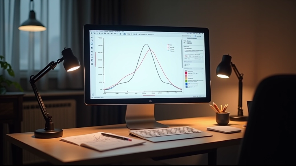
Easing functions control the acceleration and deceleration of your motion. They’re what makes interfaces feel alive. A well-timed ease-out creates satisfaction. A snappy ease-in makes interactions feel responsive. Get it wrong and your polished design becomes frustrating.
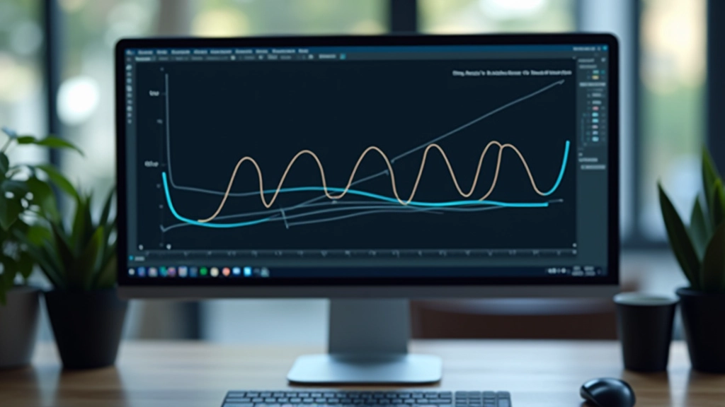
Linear easing is the foundation. Every frame moves at exactly the same speed from start to finish. If you’re animating something for 400 milliseconds, each frame covers the exact same distance.
But here’s why it feels wrong. Real objects don’t move like that. A ball bouncing doesn’t travel at constant speed — it accelerates as it falls. A door slamming accelerates, then decelerates near the end. Our brains expect natural acceleration patterns. Linear breaks that expectation.
Use linear for: continuous rotations, progress bars, looping animations. Avoid it for: transitions, interactions, anything that feels like a physical object moving.
This is where precision happens. Cubic-bezier curves use four control points to define how motion accelerates. You’ve probably seen the syntax:
cubic-bezier(0.25, 0.1, 0.25, 1)
. That’s the standard ease function browsers use.
The curve creates natural acceleration. Ease-out (the most common) starts fast and slows down. Your eye perceives this as settling — like something coming to rest. Ease-in does the opposite, building momentum. Ease-in-out combines both for a natural start and finish.
The real power? Custom curves. Want your button to have a bit more bounce? Adjust those control points. Need a snappier response? Tighten the curve. You’re not limited to presets.
Spring easing doesn’t follow a simple curve. It overshoots, bounces, and settles. You’ll see this on modern interfaces — a button that springs back when you click it, a modal that bounces open.
Springs have parameters: stiffness (how tight the bounce is) and damping (how quickly it settles). A high stiffness with low damping creates lots of bounce. Lower stiffness with higher damping feels more controlled and refined.
Don’t overuse spring functions. They’re personality. They’re memorable. But use them too much and your interface becomes distracting. Reserve them for key moments — successful submissions, important reveals, delightful micro-interactions.
Here’s how to pick the right easing for different scenarios:
Use ease-out (cubic-bezier(0.25, 0.46, 0.45, 0.94)) for 200ms. It feels responsive without being jarring. The quick initial response makes it feel like the button is reacting to you.
Ease-in-out works here (cubic-bezier(0.4, 0, 0.2, 1)) for 300-400ms. It’s deliberate without feeling slow. The modal opens smoothly and closes with intention.
Keep these subtle with ease-out over 800-1200ms. You don’t want to fight the user’s scrolling rhythm. The animation should feel like it’s revealing content, not forcing attention.
Linear works fine for spinners (they’re continuous). But for progress indicators, ease-in slightly to show deceleration as you near completion. It feels more satisfying.
Spring functions shine here. A subtle bounce (cubic-bezier(0.68, -0.55, 0.265, 1.55)) on success feels celebratory. A quick shake on error (using keyframe animation) feels reactive.
Use ease-out for 150-200ms. The quick open/close makes navigation feel snappy. If you’re fading opacity, match it with scale for a cohesive feel.
The best way to test easing functions? Watch them in context. Don’t just look at the curve — watch the actual animation. Does it feel right? Does it respond when you expect it to?
There’s a trick: slow down your browser’s animation speed in DevTools. Set it to 4x slower. If your animation still feels good at one-quarter speed, you’ve got something solid. This catches janky timing immediately.
Compare against native apps. iOS animations tend toward ease-out with specific timing (usually 300-400ms). Android uses slightly different curves. If your web animation matches that quality, you’re on the right track.
Avoid linear for interactive animations. It feels unnatural because real objects don’t move at constant speed.
Ease-out is your default. It creates a sense of settling and completion. Most professional animations use it.
Timing matters as much as easing. 200ms feels snappy. 400ms feels intentional. 800ms+ feels considered. Pick the right duration for your interaction.
Spring functions add personality. Use them sparingly for memorable moments — they’re eye-catching and delightful when used right.
Test at slow speeds. Your animation needs to feel good even when it’s slowed down. This reveals any awkward timing or jank.
The next time you’re building an interface, pay attention to the easing. You’ll notice the difference immediately. And so will your users.
This article provides educational information about animation techniques and easing functions in web design. The examples and recommendations are based on common best practices and technical standards. Implementation results may vary depending on your specific browser environment, device capabilities, and user preferences. Always test animations across different devices and consider accessibility needs — some users have motion sensitivity and may have animations disabled through their system settings. This article is for informational purposes and isn’t a substitute for hands-on experimentation and testing in your own projects.