Hover Effects That Don’t Feel Clunky
The timing, easing, and restraint that separates smooth interactions from jarring ones. Learn the subtle differences that make hover effects feel natural.
Read ArticleUsers don’t mind waiting if they know something’s happening. Skeleton screens, progressive loading, and micro-feedback animations all communicate progress differently. Learn which to use where.
That blank screen while content loads? It’s more stressful than you’d think. Users’ brains start running through possibilities — did it freeze? Is the connection broken? Did I click it twice? Without feedback, a 2-second wait feels like 5 seconds.
The real magic isn’t making things faster — it’s making the wait feel shorter. You do that by talking to your users. Show them something’s happening. Show them what’s coming. Show them how much longer. It’s the difference between frustration and patience.
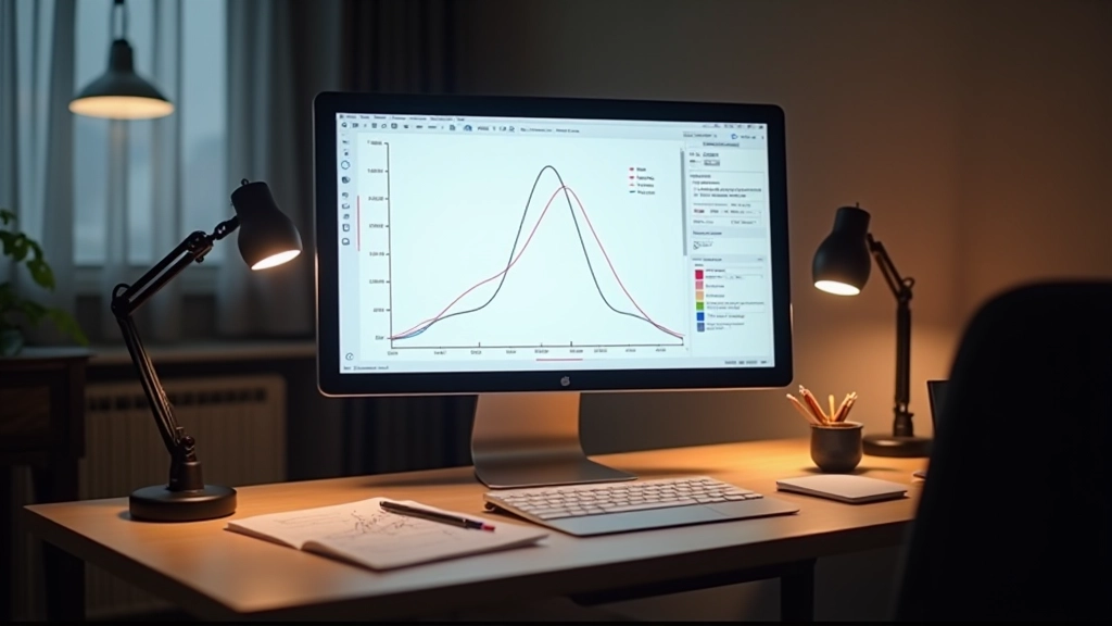
A perceived loading time of 3 seconds feels acceptable. A blank 3 seconds? That’s when people bounce. The animation itself doesn’t speed anything up — it just makes the brain stop worrying.
Different situations call for different approaches. Here’s when you’d use each.
The classic rotating circle. Works when you don’t know how long something will take — file uploads, API calls, background processing. Keep them simple. A subtle spin takes 2-3 seconds per rotation. Too fast feels anxious. Too slow feels broken.
Gray placeholder boxes shaped like your content. Headlines, paragraphs, images — all represented with neutral blocks that pulse or fade. Feels faster because the layout’s already there. People see structure instead of nothing. This is what the final page will look like.
Use this when the wait is longer and you know roughly how long. Downloads, installations, multi-step processes. Humans are wired to track progress bars — it gives us a finish line. But don’t fake it. If it says 80%, don’t sit at 80% for 10 seconds.
Subtle animations that acknowledge action. A button that pulses when clicked. Text that fades out while new content fades in. Subtle color shifts. These tell the brain “I received your input and I’m working on it” even if nothing visual changes yet.
Skeleton screens are getting more popular because they actually work. Instead of a spinner that makes people wonder what they’re waiting for, you show them the shape of what’s coming.
The key is matching your actual layout. If your article has a title, image, and two paragraphs, your skeleton should show exactly that. Don’t show a skeleton that looks different from your real content — that’s confusing.
Animation-wise, keep it subtle. A gentle pulse every 1.5 seconds or a slow fade from 60% opacity to 100% and back. Not a dramatic flash. The motion should feel calm, not urgent. You’re not trying to grab attention — you’re just reminding them something’s happening.

A 300ms animation feels snappy. A 600ms animation feels natural. A 1200ms animation feels slow. Most loading states work best between 400-800ms.
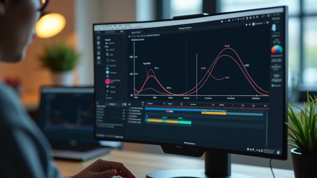
Here’s what actually matters: consistency. If your spinner rotates in 2 seconds, keep it at 2 seconds. If your skeleton pulses every 1.5 seconds, be consistent. Users’ brains lock onto rhythm. A consistent rhythm feels intentional. Irregular timing feels broken.
And here’s something most people miss — don’t loop animations forever. If the actual load takes 8 seconds, your animation should still feel engaging at second 7. Most spinners just keep spinning. Better approach? Add a small text update. “Still loading…” or “Almost there…” Just knowing it’s not frozen makes the wait feel different.
Different contexts need different approaches. Here’s how professionals handle common scenarios.
Button pulses and text changes to “Sending…” The button stays in a loading state for at least 600ms even if the request is instant. This prevents double-clicks and feels intentional. Once complete, show a checkmark for 1 second before redirecting or showing results.
Images load progressively. Show skeleton placeholders for each image while they fetch. As each image arrives, fade it in over 300-400ms. The page feels like it’s building itself instead of being blank then suddenly full.
Show the shell immediately with skeleton screens for dynamic content. Charts, lists, tables — all represented by placeholder blocks. As real data arrives, skeleton blocks fade out and real content fades in. Feels like the page is being populated, not reloading.
Don’t go blank. Show a subtle progress bar that starts immediately and moves smoothly. Even if it takes 2 seconds, a moving progress bar feels faster than watching nothing happen. End with a quick fade-in for the new content.
Ironically, a loading animation that stutters makes everything feel slower. Use CSS animations for performance. JavaScript animations will cause jank. Stick to transform and opacity properties — they’re GPU-accelerated and smooth.
A simple spinner using CSS `@keyframes` with `transform: rotate()` is all you need. A skeleton screen using CSS `@keyframes` with `opacity` changes is efficient. These will run at 60fps even on older phones.
Test on real devices, especially phones. That smooth animation on your MacBook might stutter on a 3-year-old Android. If it stutters, simplify it. A smooth simple animation beats a janky fancy one every time.

Loading states aren’t just decoration. They’re communication. You’re telling your users “I’m working on this. I haven’t forgotten about you. Here’s what’s happening.” That message matters more than you’d think.
The best loading states are invisible — users notice them only because they work. A smooth spinner that rotates consistently. A skeleton screen that matches your layout perfectly. A progress bar that moves smoothly. A button that gives feedback instantly. None of these are flashy. They’re just honest.
Next time you build a loading state, think about what your user is feeling in that moment. They just clicked something. They’re waiting. They’re wondering. A good loading animation answers their question: “Yes, I got it. Something’s happening. Hang tight.”
Understand how timing, easing, and micro-interactions work together to create polished user experiences.
Continue ReadingThis article provides educational information about web animation design principles and best practices. The techniques described are general guidance based on common design patterns. Implementation may vary depending on your specific project requirements, browser compatibility needs, and performance constraints. Always test animations on real devices to ensure they perform smoothly. Consider accessibility requirements when implementing animations, as some users may prefer reduced motion.